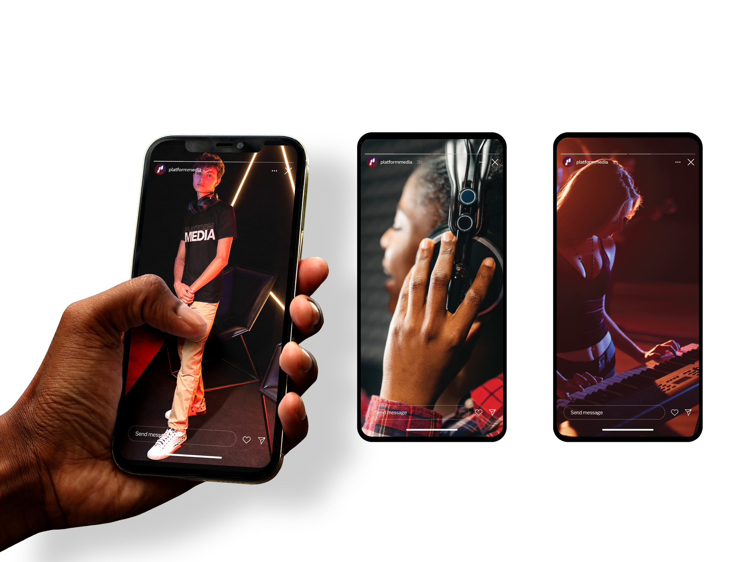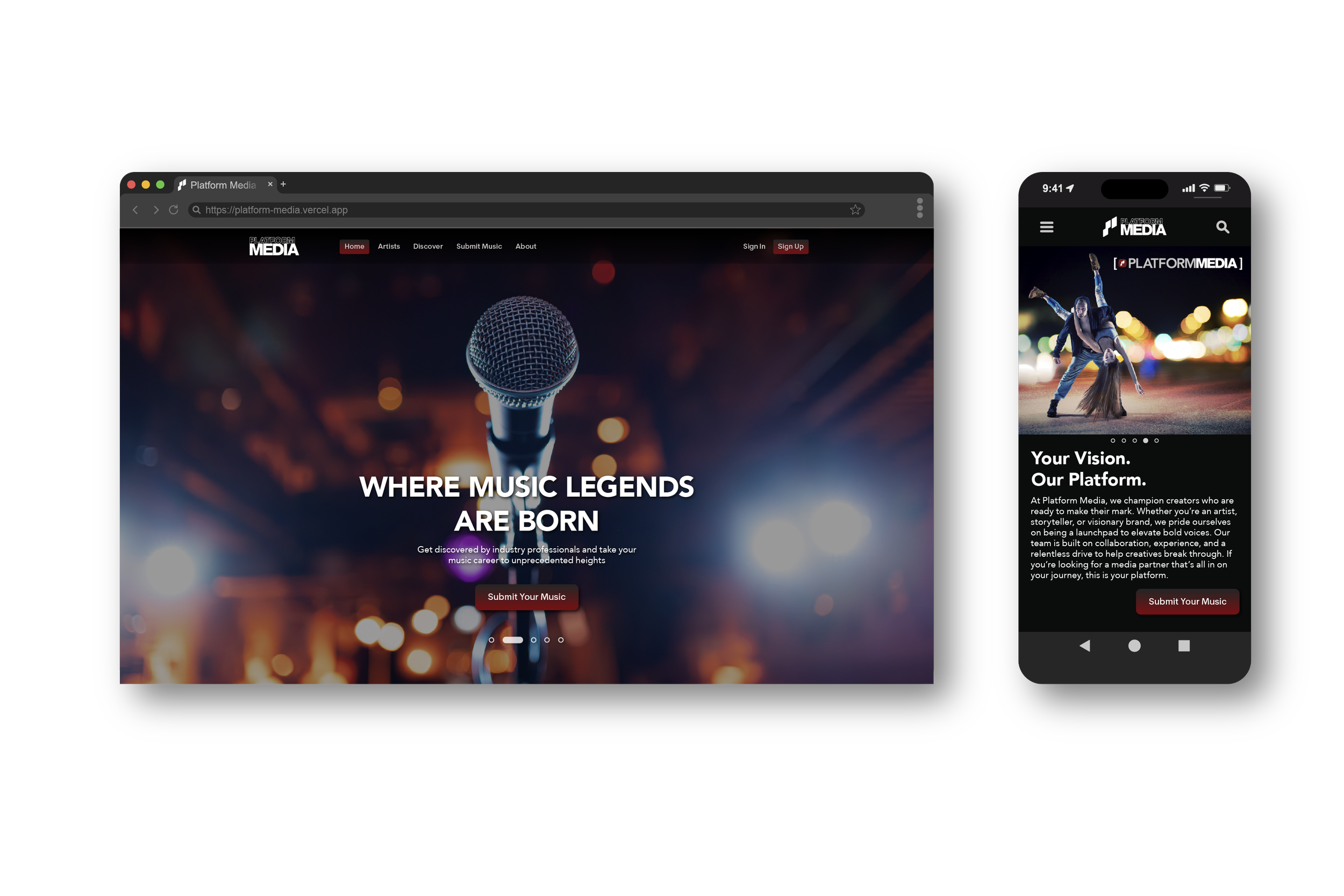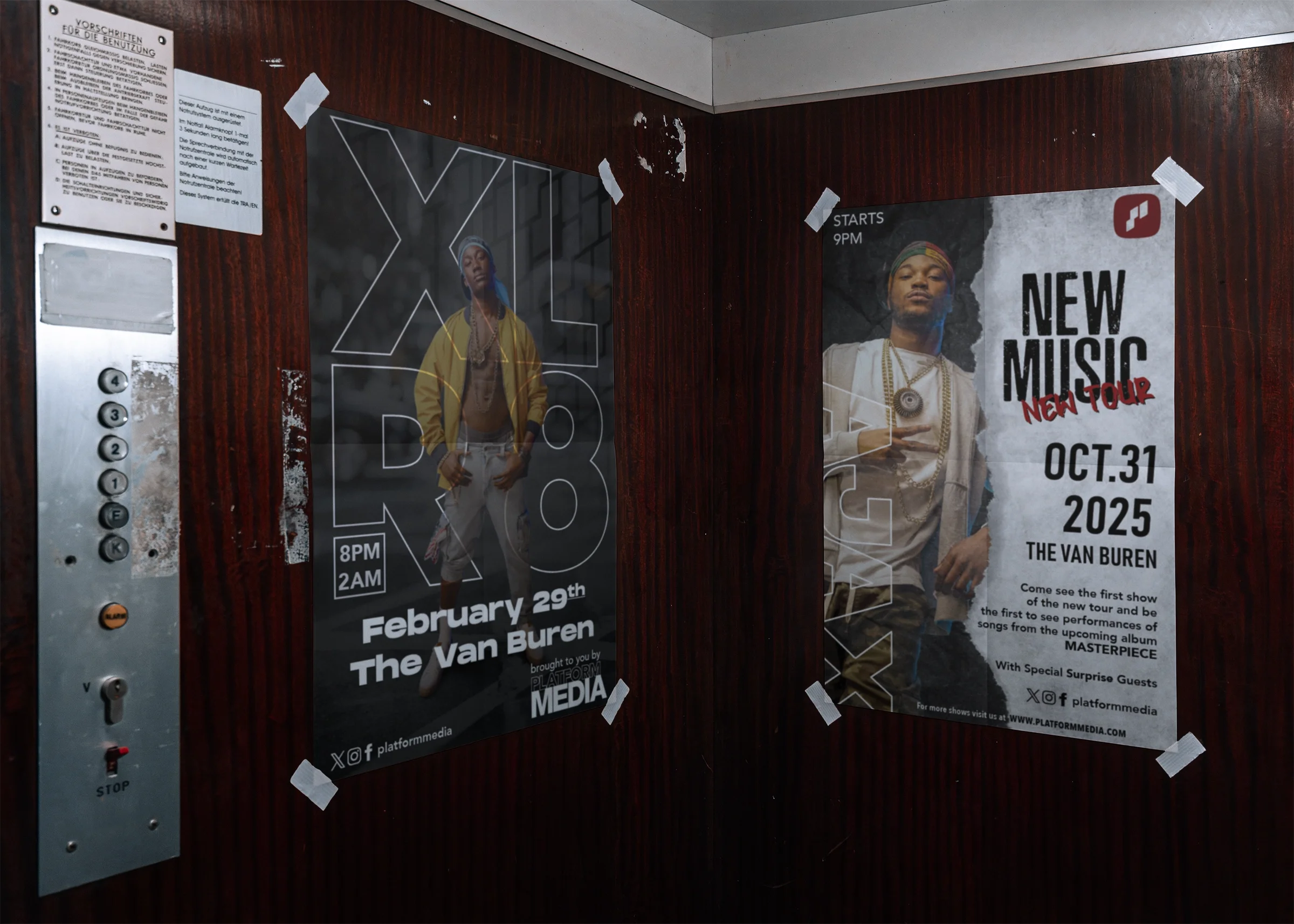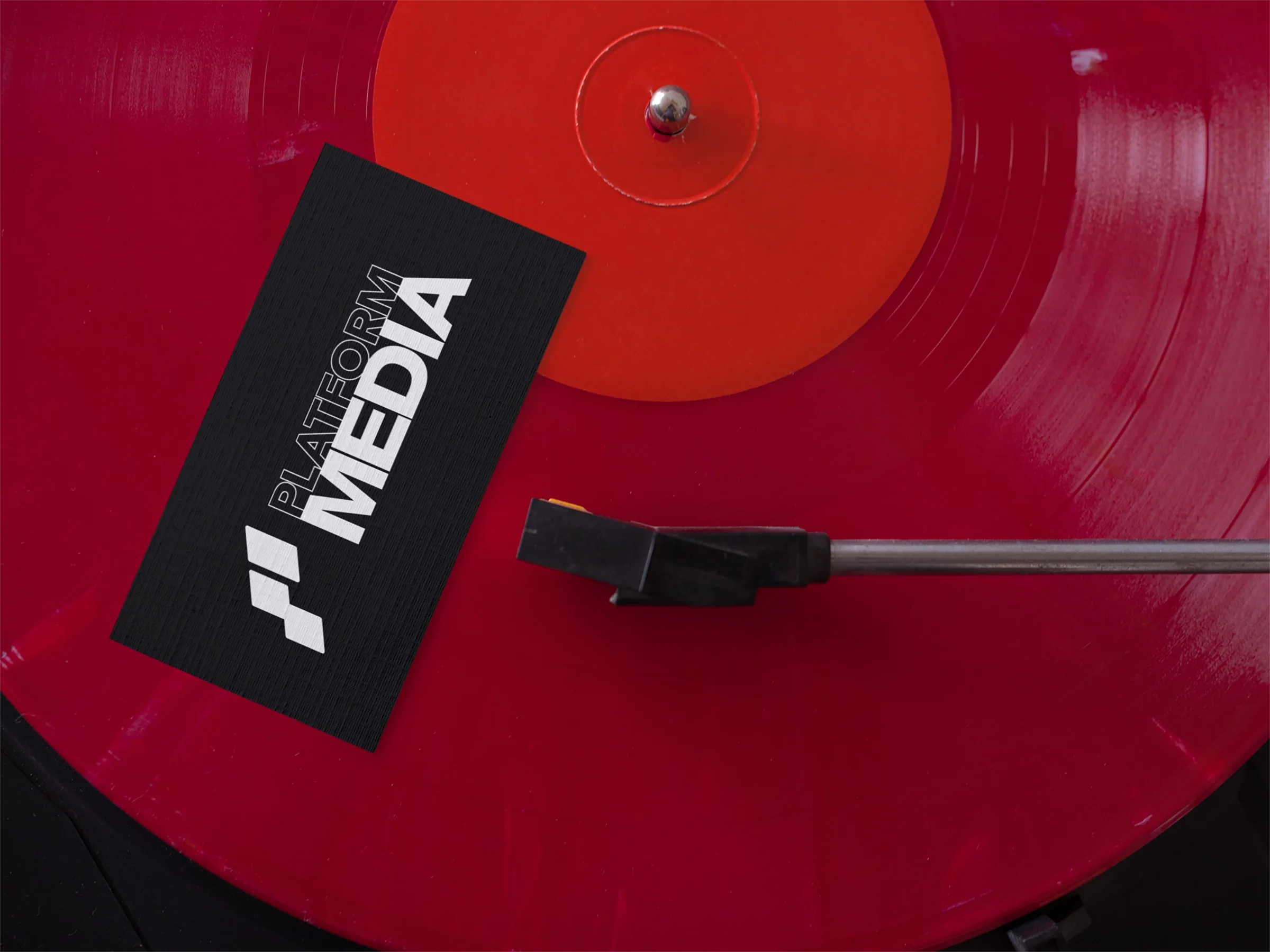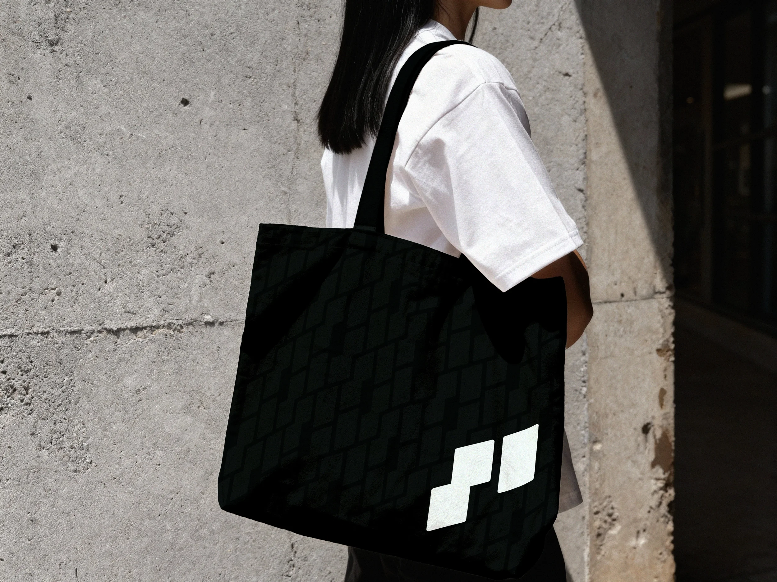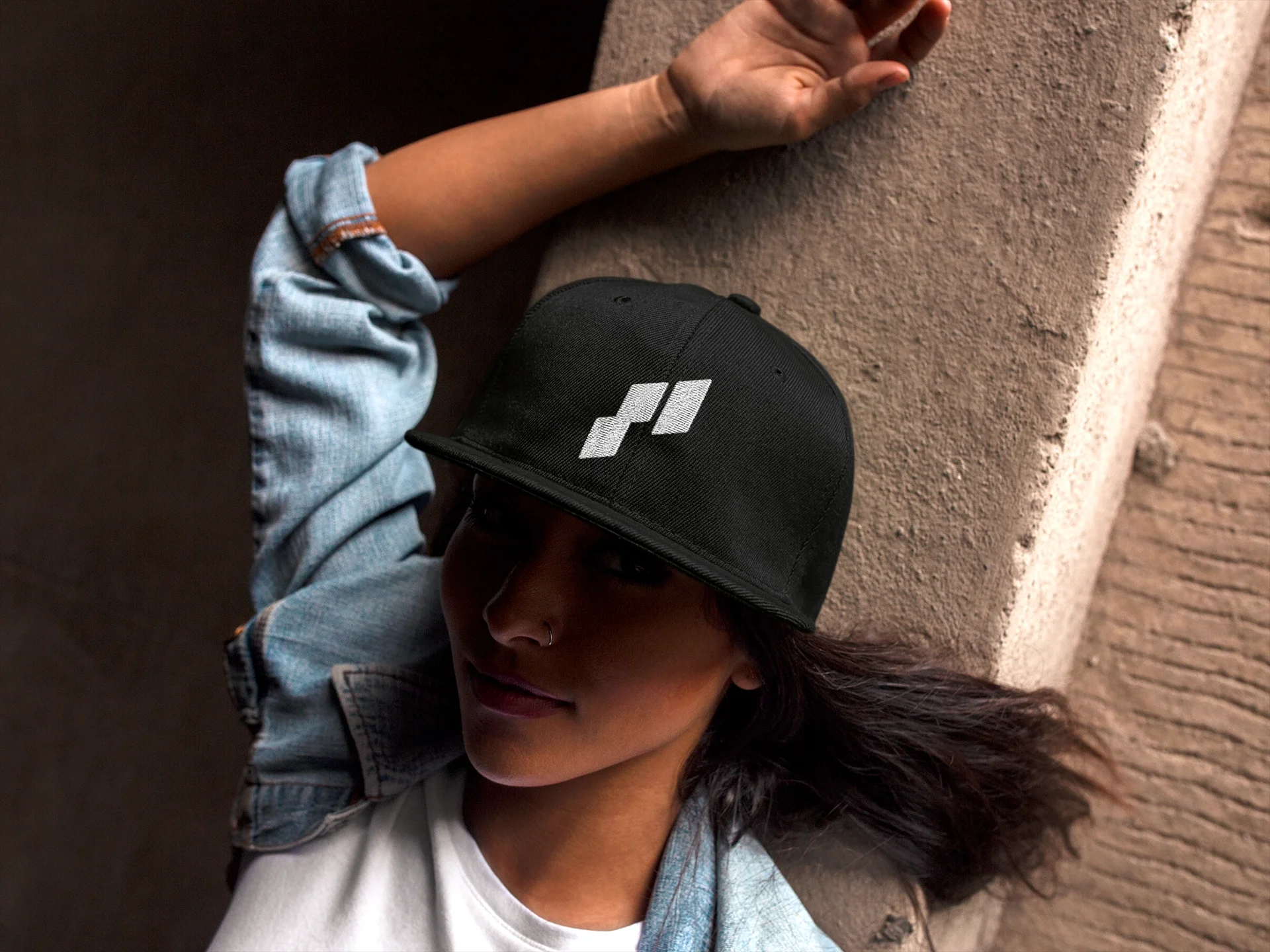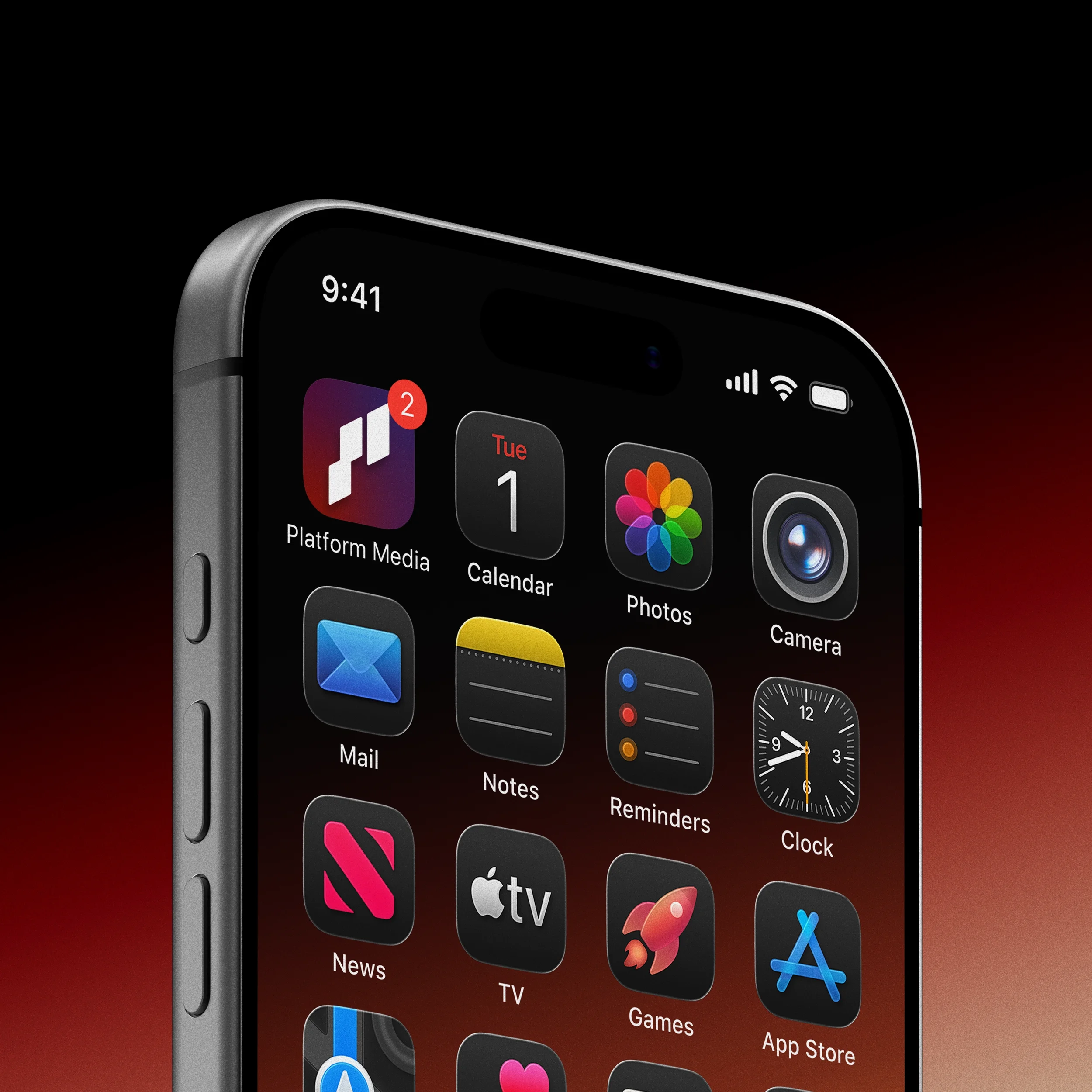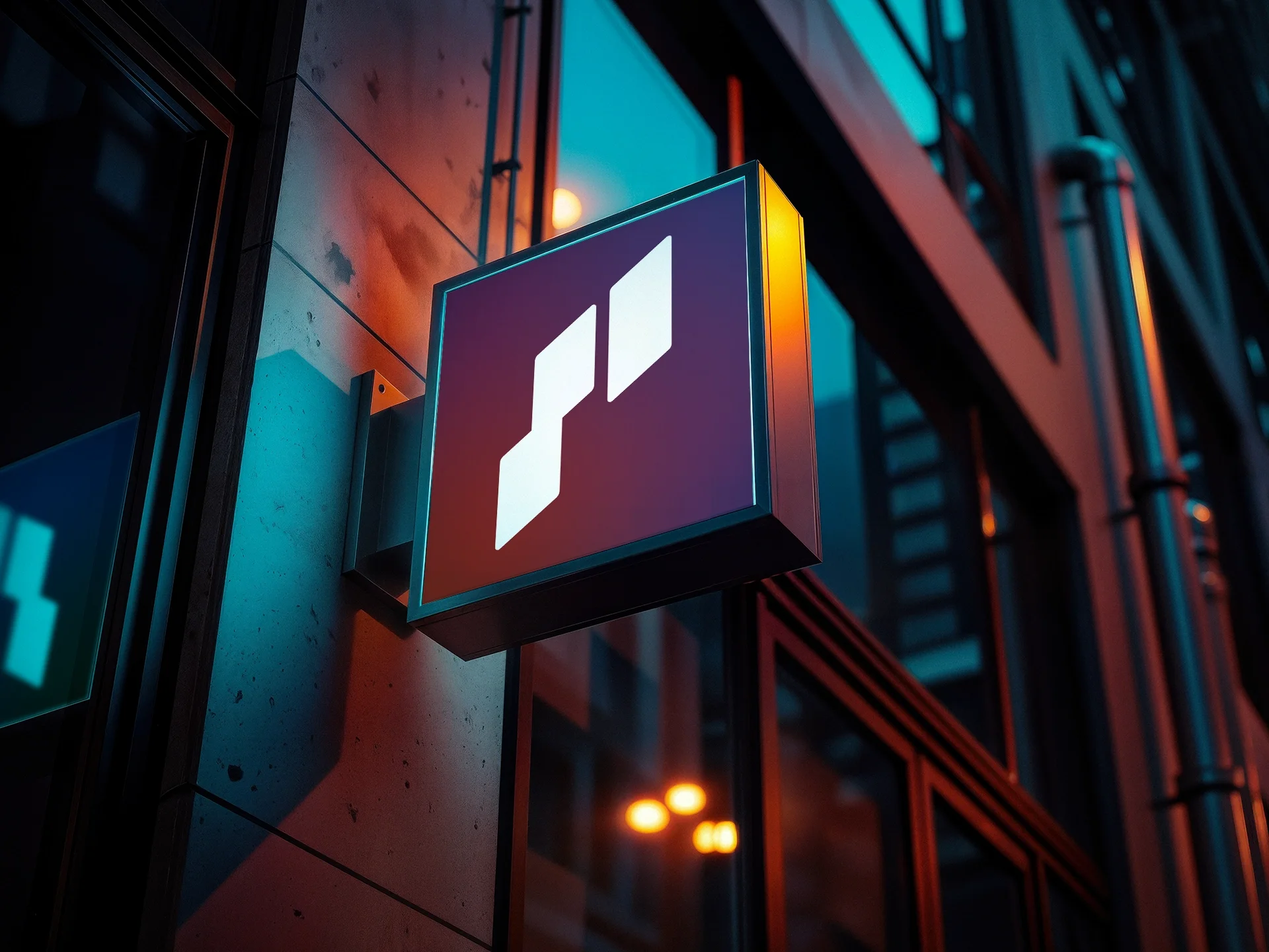
Platform Media is a media company focused on empowering creators and acting as a launchpad for emerging talent, looking to connect them with industry professionals. The owners have a passion for music and reached out to me for a brand identity. They needed a visual identity that would stand out in a saturated market, yet would still convey the professionalism needed to bring creatives and industry giants to the same table. This contrast of creative energy and structural support was the foundation of their identify, so finding a mark that could convey these ideals while staying recognizable at any size and flexible across platforms was incredibly important to them.
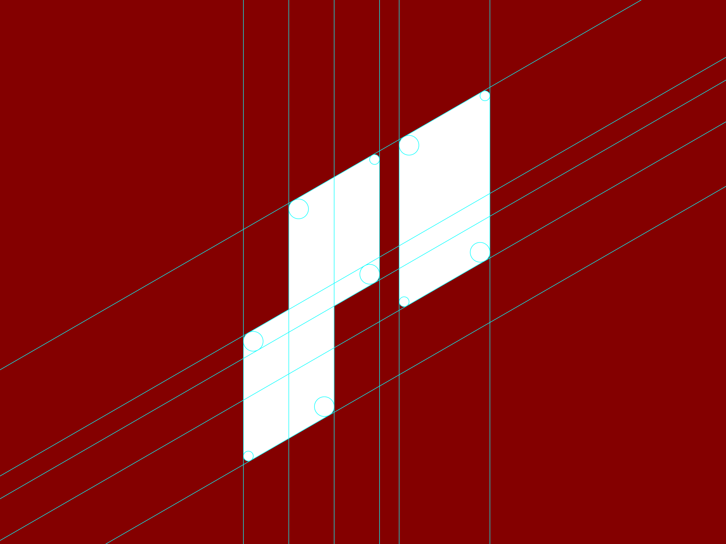
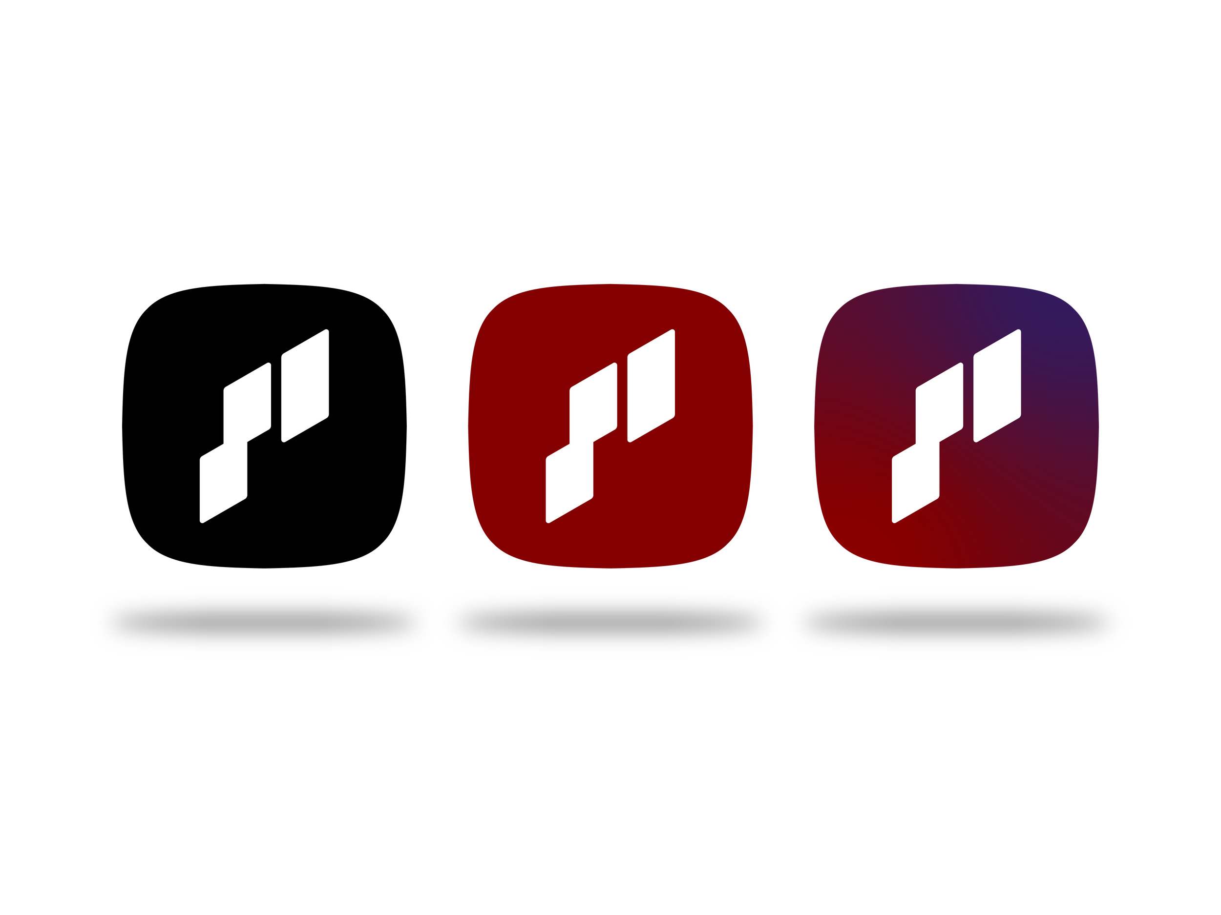
Starting with the name, I began with an geometric letter “P” monogram that doubles as an abstract music note. The stepped design is meant to communicate movement and growth for those signed under the label, helping to bring creators up. The clean, structure offers support, while the soft rounded corners maintain a sense of approachability and warmth. The mark was then encased in a squircle, a nod to app icons and digital accessibility. This bounding shape also gives the mark a point of contrast allowing it to remain visible in a 1:1 ratio and at any size.