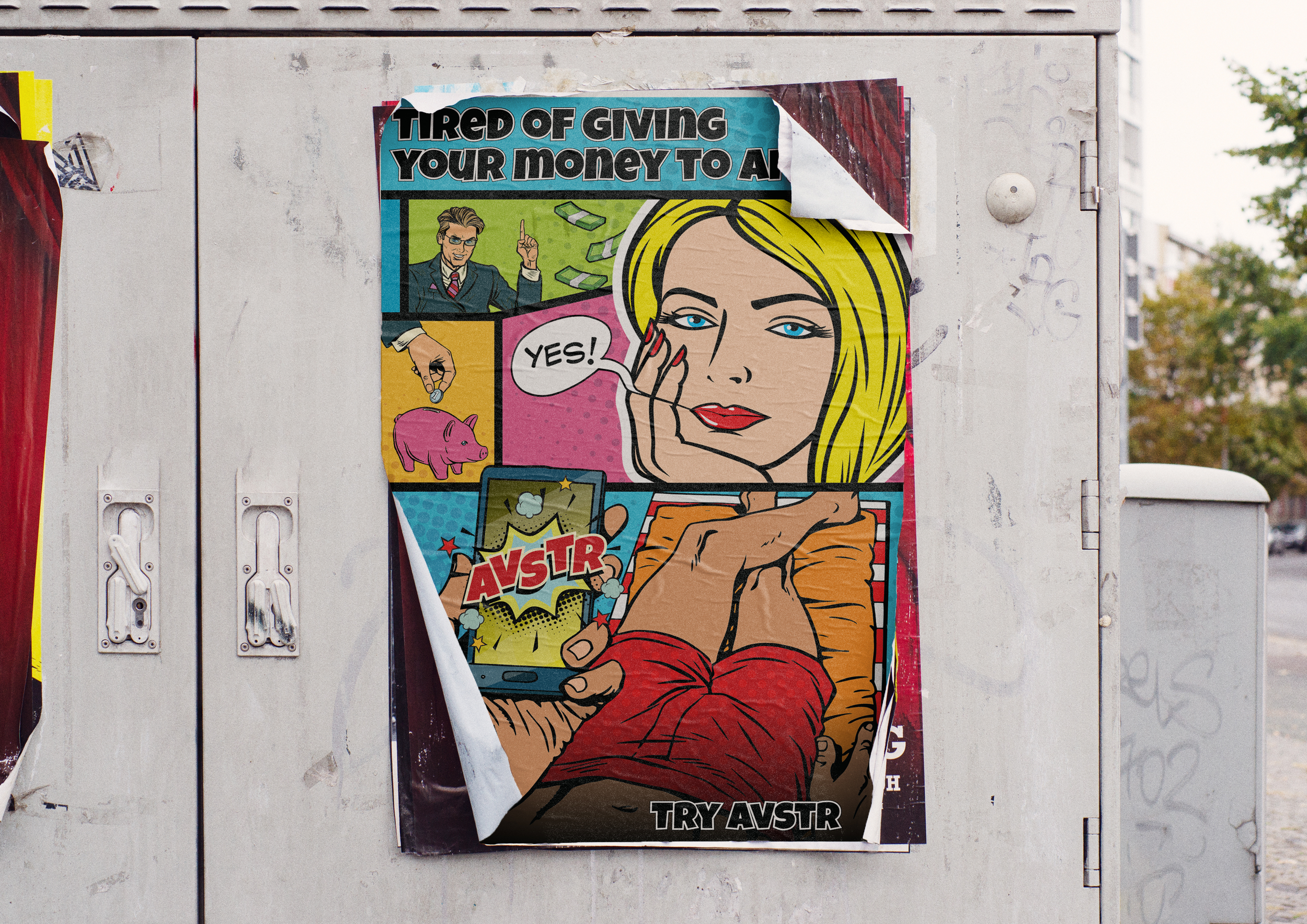



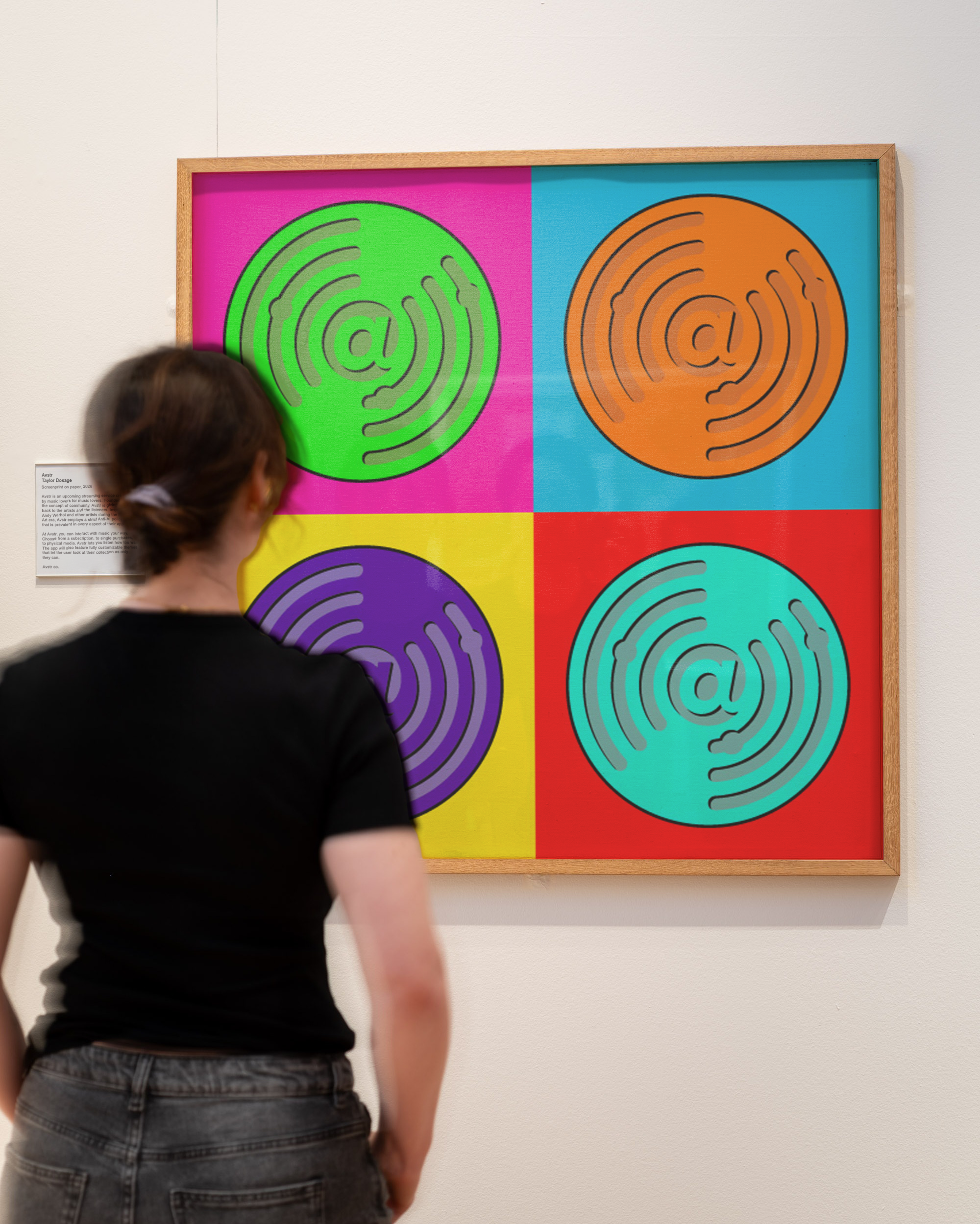
Avstr is a music streaming software designed for music lovers. Tired of seeing their money go to private equity instead of the musicians they loved, the founder decided to create a platform that would better represent them and other listeners with a genuine passion for music. Avstr employs a strict anti-AI policy and offers customers flexibility in how they want to listen to their music. The app provides both a subscription for streaming and/or flat fees for music so that customers can actually own their libraries again. They also include forums for fans to connect with each other and have plans to offer physical media and ticketing to further give fans control of where their money goes.
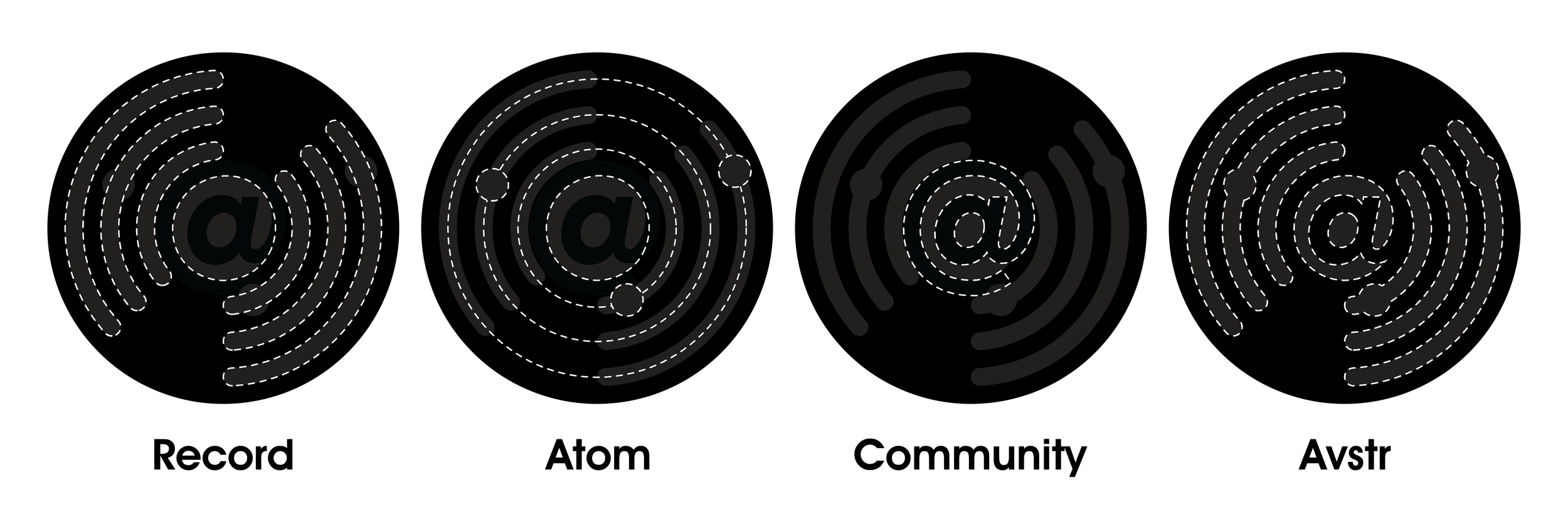
Avstr needed an identity that would convey this customer- and artist-first ethos. Inspired by the movement behind Pop Art, Avstr wanted a logo that would focus on bridging the gap between listeners and artists and would represent their integrity and focus on transparency as a brand. After agreeing to a stylistic direction and a list of brand nouns, I started with the brand mark. With an app icon in mind, the founder opted to include an “A” in the design. This quickly became an “@” symbol at the center of a vinyl record to convey the community focus of the streamer. The grooves evolved into electrons circling the nucleus of the design, symbolizing the human touch that was incredibly important to the brand. The design remains simple and clear despite the amount of ideas represented, allowing it to remain identifiable as a small scale.
The word mark is a customized signature as a connection to their artistic roots and to further demonstrate their commitment to human-made work.