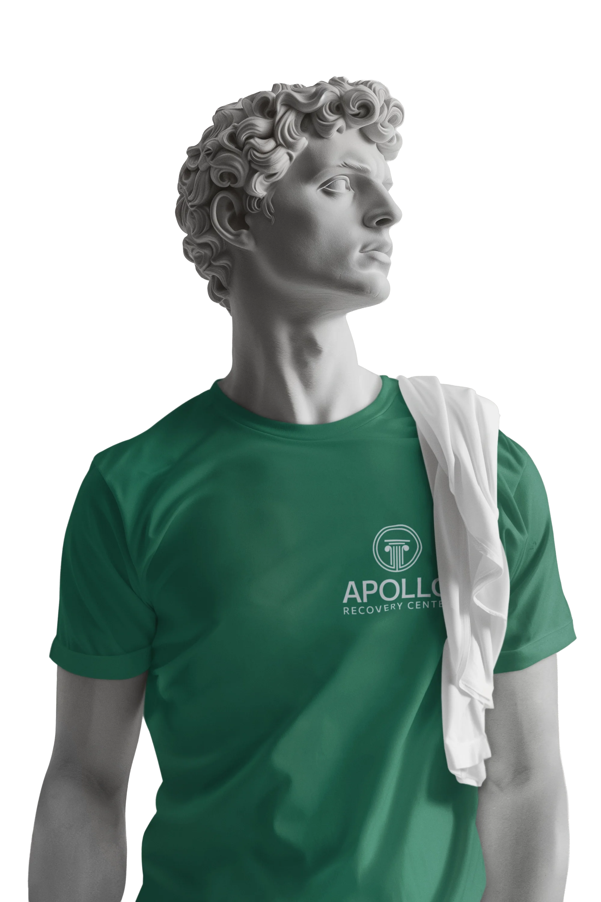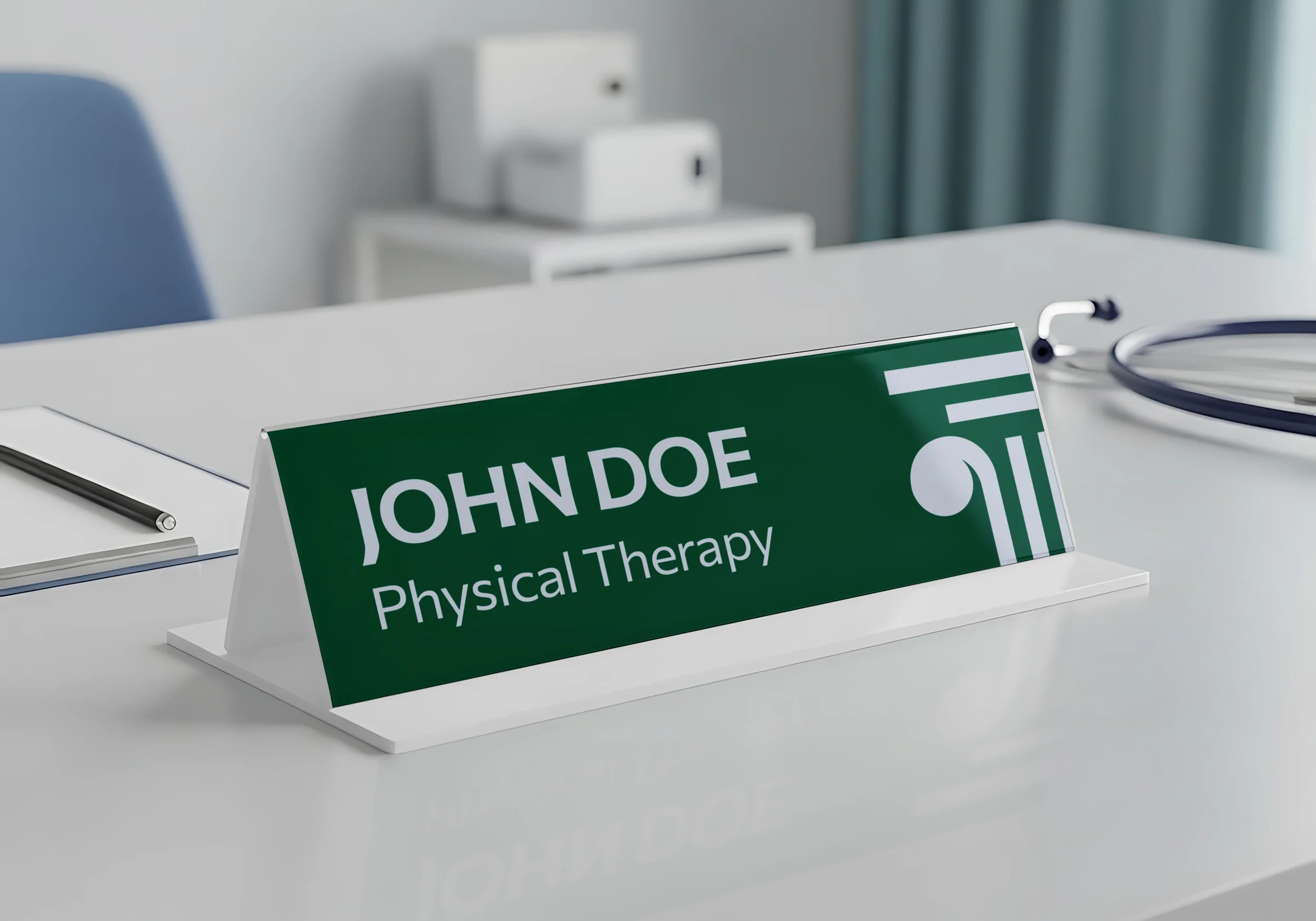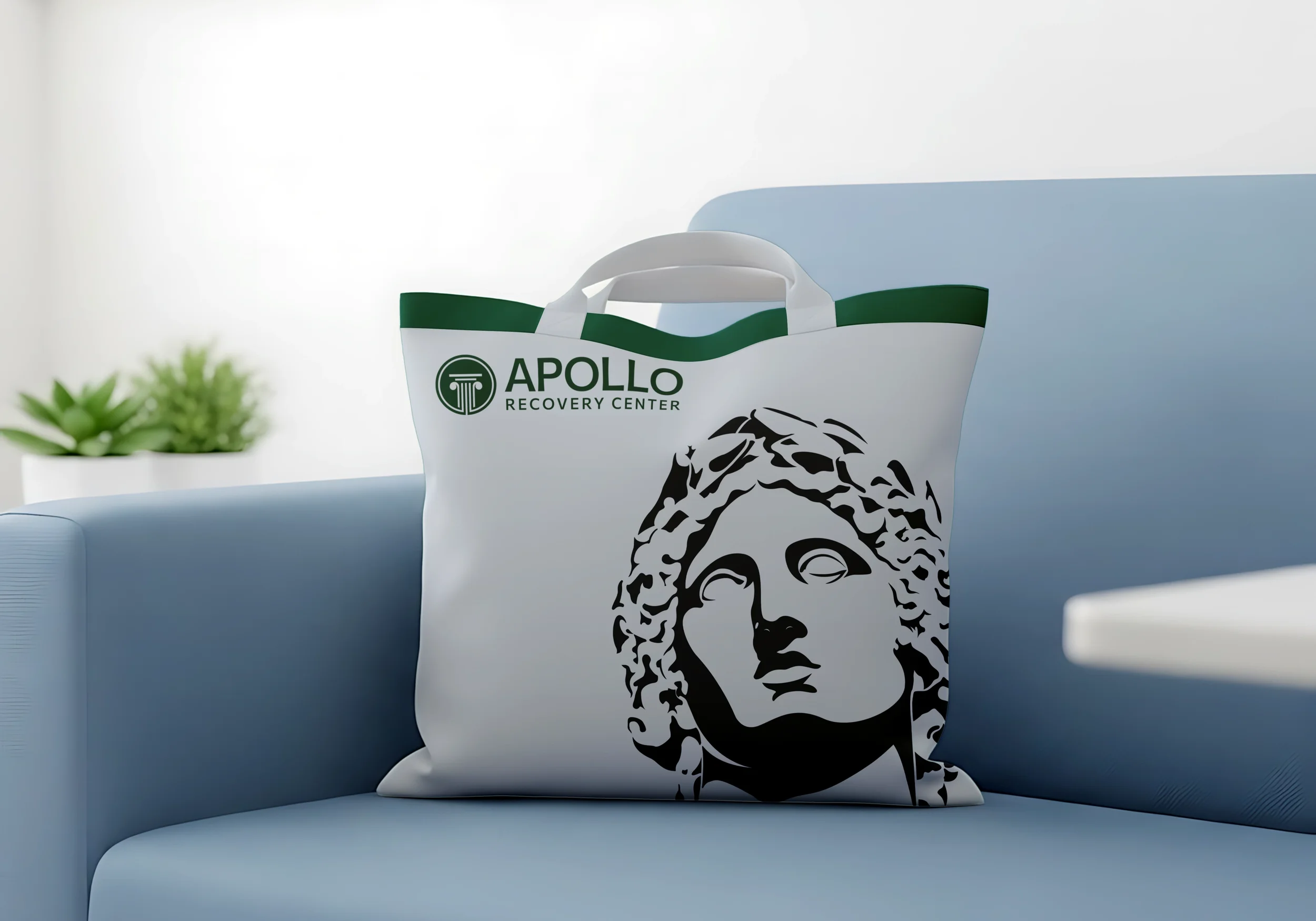
Orbit LA is a rehabilitation facility in Los Angeles and part of a larger network of inpatient and outpatient treatment centers dedicated to helping individuals overcome addiction and build healthier, more fulfilling lives. Orbit LA strives to create an environment centered on community and personal growth, equipping individuals with practical life skills, fostering meaningful connections with others, and providing the support necessary to maintain long-term sobriety. The challenge was to develop a brand identity that moved away from the cold, clinical perception often associated with rehabilitation centers and instead communicated a sense of comfort, optimism, and belonging. The identity needed to feel professional and trustworthy while remaining approachable, friendly, and engaging to those beginning a new chapter in their lives.
The resulting identity centers on a custom geometric logotype and a planetary mark that gives visual expression to the brand's name and philosophy. Clients wish to remain within a familiar, supportive community as they transition between facilities and stages of recovery, so the planet and its surrounding orbit represent the continuous journey of growth, stability, and connection. A custom-built geometric typeface further establishes a distinctive visual personality, balancing clean, structured forms with softer, approachable characteristics.